|
|
|
| index >> About us>> Enterprise’s Culture |
|
|
|
| |
inxiang Logo |
| |
 |
Design notes of Jinxiang Logo
Jinxiang Logo is comprised of the English abbreviation of Jinxiang Petrochemical and 4 Chinese characters "Jin Xiang Shi Hua". The logo is in red and grey. The red color expresses happiness, prosperity and the features of petroleum industry ; the grey color shows the softness and elegance, and represents the corporate business concept which indicates safe, excellent, convenient and win-win. |
|
| |
|
| |
| |
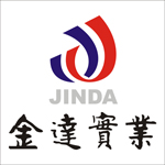
Jinda Logo |
| |
 |
Design notes of Jinda Logo
Composition of the logo
It is comprised of 3 sectors. The upper section is represented in the shape of "d " by 2 tumbled English letters "J"crossed in read and blue; the middle sector is comprised of Pinyin “JINDA” in silver grey; the lower section is the inscription “Jin Da Shi Ye” by famous calligrapher Mr. Wu Zhongqi
II、 Design notes of the logo
1、The upper sector in the shape of d by 2 tumbled "J "which represents the abbreviation "JD" of "JINDA" shows the staff’s enterprising and confidence; the red color represents happiness and prosperity; the blue color represents the company’s cohesion and overall competence and the business concept of "practical approach, exploration, stability and excellence".
2、The middle silver grey Pinyin "Jinda" represents unique company brand of Jinda Industry "stability and conservation" and the spiritual system of standing up, survival and development in adventurous markets. |
|
| |
|
| |
| |
Petroleum China Logo |
| |
 |
Design notes of Petroleum China Logo
Petroleum China Logo is a picture formed by 10 equal sections of petals in red and yellow. The logo color is in red and yellow, which are basic colors of the National Flag of China and industrial features of petroleum and natural gas. The logo is in circular, which means the internationalization development strategy of Petroleum China. The petal style expresses the integration of main business of Petroleum China. The red base with a corner of the square standards for solid foundation of Petroleum China and implicates the infinite cohesion and creativity of Petroleum China. The appearance in the form of flowers embodies the social responsibilities of creating harmonious energy and environment by Petroleum China. Center of the logo is sunrise with shine and symbolizes prosperous development and promising future of Petroleum China. |
|
| |
|
| |
| |
|